Not the Restaurant in the Quarter
Going from zero to IronViz is pretty impossible for a media gal like me. I spend most of my time writing, editing and drumming up research on future #DataFemme guests and investing in these activities leaves little room for learning new software.
But…I must make time. The people I interview for #DataFemme are moguls in their field. Some are expert visualists, some are skilled econometricians and others are currently grappling with projects I have no hopes of fully comprehending. Nevertheless, to truly have the birds-eye view of the data science industry that I want, I need to understand what all of you do - and that means constantly refreshing my programming skills.
With Tableau, I have to start small, given that my extent of experience with it amounts only to a few mock-ups in business school and shadowing Zen-Masters on Twitter. I found a simple dataset in the place I usually look: New Orleans’ City Open Data Portal.
Seeing this visualization below, you may be surprised by the way that these drug stores are sprawled out. I promise it’s no joke. In New Orleans, you may have to walk for a good mile and a half before you run into a drugstore - something that makes me eternally grateful that I have a Walgreens on my block.
There are many reasons why certain areas of the city have less drug stores than others. One major one is that certain areas, such as the largest light pink block, are primarily made up of swampland and are therefore mostly uninhabited. The other reason is more sinister. New Orleans is notorious for allocating resources to areas of value to tourists while neglecting low-income areas, such as the gray areas on the map. In the coming weeks, I will further explore the levels of access to other resources, such as hospitals, in these particular areas, as well as police response times in comparison to the city’s averages.
The “Show Me” section of Tableau’s browser allowed me to experiment with two different kinds of map layouts. I found the layout below to be useful because the lack of shading allowed me to perceive the background map more clearly.
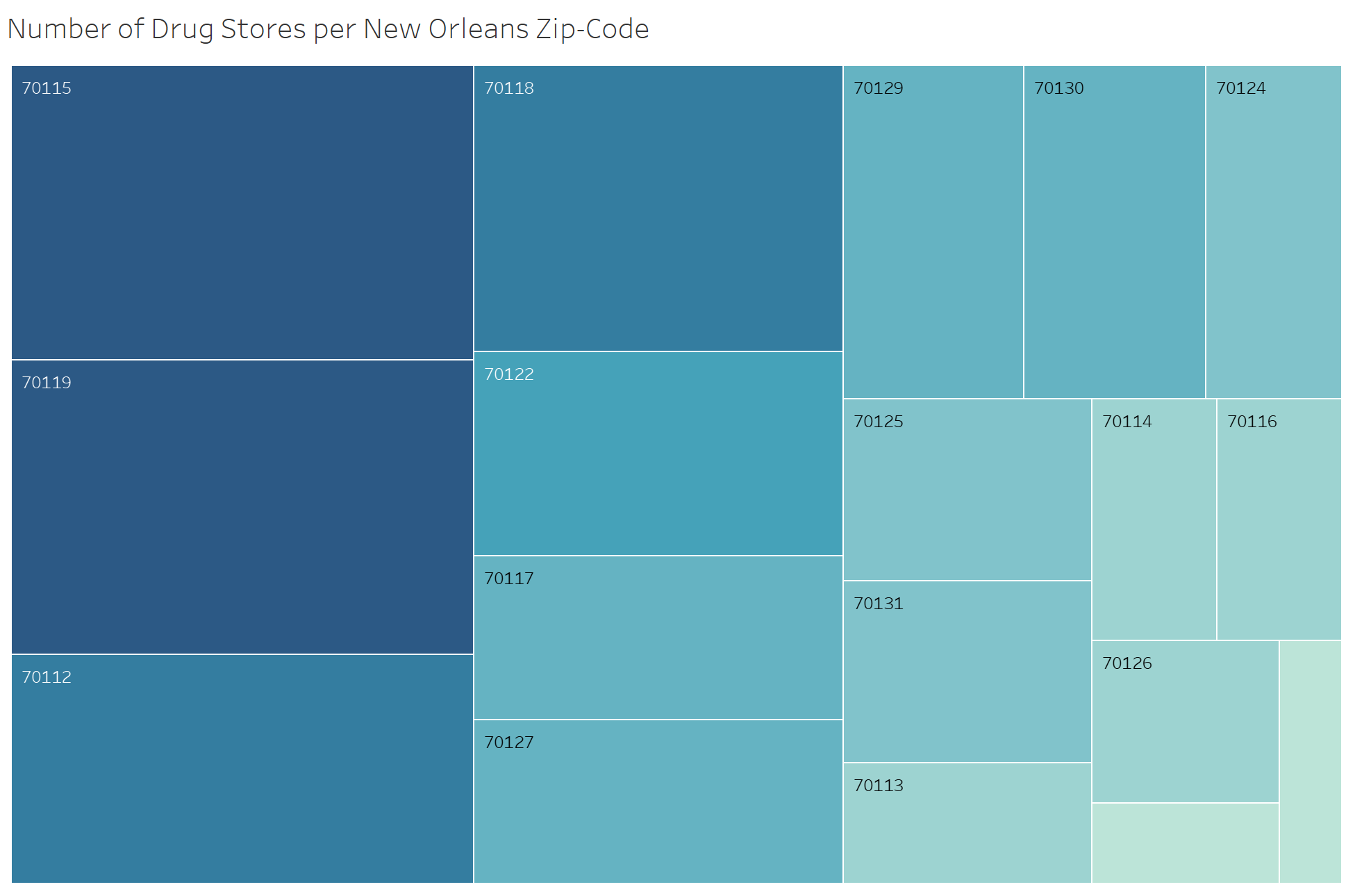
Of course, the map layouts are the most obvious choices for visualizing data like this. But I also some value in the heat map shown below, which lays out the zip codes using the darker colors for those with the most amount of drug stores and the lighter colors for those with the least. The two zip codes with the darkest coloration on this map pertain to the two richest areas of New Orleans, Uptown and Lakeview respectively. The zip codes with the lightest coloration pertain to areas of lower income, such as Central City and Gentilly. Somehow, the heat map is not showing the irrelevant areas of New Orleans that are not populated and therefore do not need drug stores. Therefore, the heat map is more illuminating when it comes to highlighting the issues of access that low-income areas of New Orleans experience.
Do you have thoughts to contribute? Questions?
Share them with me and the #DataEveryone community on Twitter
Like what you see?
Sign up to receive more such content and gain access to an exclusive community of data scientists…


